• Skip to main content

Grace Dane Mazur

Author Website

  • Home
  • Bio
  • Books
    • The Garden Party
    • Silk
    • Trespass
    • Hinges
  • Events
  • Press
  • Other Writing
  • Gardens
  • Contact

Grace Dane Mazur

Gods in the Gallery: A visit to the Museum of Russian Icons

October 3, 2012 By Grace Dane Mazur


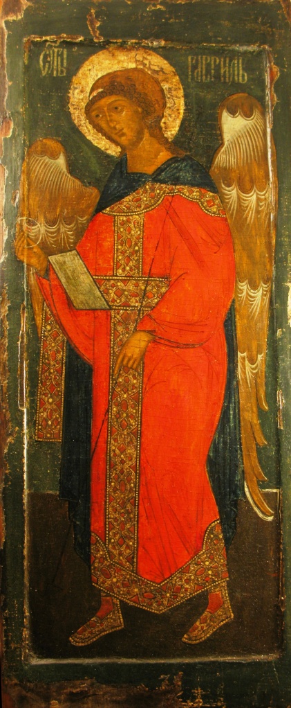
1. Archangel Gabriel c. 1600
Museum of Russian Icons

A few days ago a huge statue of Juno descended through a skylight at the Boston Museum of Fine Arts. The curator of Greek and Roman Art commented,

“As in ancient Rome, MFA visitors will be awestruck by the physical presence of the gods and the power of the empire…We are delighted to welcome Juno to the MFA….”

We often refer to statues and paintings of gods as though they were deities rather than representations. There is a complexity to the connection between secular and sacred in museums. I’d like to try to get at this complexity here.

Some Questions:

Why look at the art of a religion that is not one’s own? In many museums, particularly the grand old ones, we are continually looking at the gods of others–unless we are the most profligate of pantheists. Does our gaze change, depending on whether we are thinking:

– This is from a sacred narrative I believe in

– This is from a sacred narrative I don’t believe in.

What happens to the gods when we bring them into the gallery? Do they become deconsecrated in secular space? Or do they exert some transformative power on the space that houses them, even if they are not our gods?

These questions struck me recently when I was visiting the miraculous new Museum of Russian Icons in Clinton, Massachusetts. This place is a gem–small, multifaceted, shimmering. Started in 2006, by Gordon Lankton, a local businessman, it is now a world class museum, housing his personal collection of around a thousand icons. It is full of strange and beautiful things.

2. Saint Paraskeva c. 1620
Museum of Russian Icons

For example, how does one show that which is not representable. What I mean is, if a god has no physical attributes, what can one show? How can one evoke divine presence? Of course these questions are related to the work of writers, poets, mystics: How does one speak of the ineffable? Or know the unknowable?It is from my position as an outsider that I look at these images. I am not Russian; I don’t belong to this or any orthdoxy. My views would be heretical if I did, but as it is no one can excommunicate me. The fascination of these paintings transcends my own exclusion; new questions keep springing up.

Entering into this museum, suddenly surrounded by images, I have to ask, What are these icons? Why do they look like that?

3. Mother of God c. 1850
Museum of Russian Icons

Icons.

Icons are representations of the sacred. Although in the Judeo-Christian tradition it is forbidden to look at god and making graven images can be problematic, in Eastern Orthodox Christianity (Greek Orthodox and Russian Orthodox and related churches), icons evoke the invisible god by showing his messengers, prophets and angels, saints and and miracles. In the case of Christ, his human aspect may be portrayed. (Though at certain times in history this, too, was mortally dangerous.) While occasionally the Ancient of Days occurs as an old man in icons, it is unclear if he is meant to be God or an eternal form of Christ.

Sometimes an icon depicts a sacred place, or scriptural narrative, or the painter’s own mystical vision or dream encounter.

4. Saint George and the Dragon c. 1750
Museum of Russian Icons

In this, and many other icons of Saint George, the dragon–like some dark shadow of the saint’s white steed–occupies a strange sort of space both beside and beneath the horse.

5. Not made by Hands. c. 1525
Museum of Russian Icons.

Icons showing only the head of Christ often have the startling title “Not made by Hands.” The prototype for this image is said to come from the image of Christ’s face on a towel he used after his ablutions.

The Greeks.

Why do Russian icons look like that? Where did this style of painting come from?
The simple answer is that the Russian painters were schooled by Byzantine Greeks, among them Theophanes the Greek, a Cretan trained in Constantinople, who moved to Russia in 1370. He was said to be a philosopher; his style is personal and expressionistic, as in his well known “Transfiguration” showing Christ on the mountain top, with Elijah and Moses beside him, witnessed by his disciples, Peter, John, and James, who appear stunned, bowled over. (Matthew, 17:2)

6. Theophanes the Greek. 1408. Transfiguration of Christ.
Tretyakov Gallery, Moscow. Courtesy Wikipedia.

But saying that the Greek painters taught the Russians just pushes back the question to how did the Greeks go from Zeus/Poseidon:

7. Zeus (or Poseidon) from Artemision. 460 BC.
National Museum of Athens. Courtesy Wikipedia.

to Christ Pantocrator:

8. Christ Pantocrator. 6th Century.
Saint Catherine’s Monastery, Mount Sinai.
Courtesy Wikipedia

Fayum.

9. Man. Fayum. c. 117-138 AD.
Antikensammlung, Munich
Courtesy Wikipedia

The origins of Greek icons lie in Egypt – more precisely in the burial portraits of Greeks living in the Fayum region of Roman Egypt in first three centuries AD. These portraits, called the Fayum portraits, were painted from life, on wood or on linen. After death, the portraits were placed over the mummy of the subject, usually wrapped into place with linen bands. Often fully frontal or three-quarters view, they are brilliantly individual, and startlingly lifelike. We could pick each one out of a crowd of Egyptian Greeks, then or now. They look as though they have just spoken and are now listening, as though they are about to break their silence or stillness.

10. Woman from er-Rubayat. Fayum.
c.161-192 AD. Courtesy of the
Trustees of the British Museum

From mainland Greece only a handful of ancient paintings on wood panels survive. But in Egypt, because of the dry climate and with the adoption of local religious burial practices by these transplanted Greeks, around a thousand of Fayum portraits have been unearthed. They are now displayed in collections around the world. They have been brilliantly gathered and discussed in Euphrosyne Doxiadis’s The Mysterious Fayum Portraits.

11. Young girl “The European.” Fayum. c.117-138.
Louvre, Paris. Courtesy of Wikipedia


12. “Eirene.” Fayum. c. 37-50 AD.
Photo: P. Frankenstein / H. Zwietasch; Landesmuseum Württemberg, Stuttgart

“Eirene” is possibly the most beautiful of the Fayum portraits. The late Egyptian Demotic inscription across her neck reads:

Eirene, daughter of S–, May her soul rise before Osiris-Sokar, the great God, Lord of Abydos, forever.

The Techniques of the Fayum Portraits.

Two different techniques are used in the Fayum portraits: egg tempera, in which pigments are mixed with egg yolk; and encaustic, in which pigments are mixed with hot beeswax. Since beeswax does not mix with water, encaustic is impervious to moisture, and it doesn’t seem to darken or degrade with age. The encaustic portraits are vibrant and arresting, even after two millennia. All the Fayum portraits I show here are encaustic. Tempera, which was used much less often for burial portraits, is less stable as the proteins in egg yolk are water soluble.

Icon painters also use both techniques but egg tempera is by far their favorite. It can be worked more delicately, with finer brushes and greater variety of strokes. All but one of the icons I show here are done in tempera.

Beginnings of Christian Art.

In the Judaic tradition the first icon maker is the god of Genesis:

So God created man in his own image, in the image of God
created he him; male and female created he them.

The beginnings of Christian art are less well known but a good place to start is at the Onassis Cultural Center with the exhibition,”TRANSITION TO CHRISTIANITY: Art of late Antiquity, 3rd-7th C AD.” Slobodan Curcic, writing in the catalogue of this show, explains the vehement and torturous arguments which shaped the early Christian view of art. He describes how Clement of Alexandria expanded the notion of god’s image-making into a layered hierarchy:

The first level of image that god makes is the invisible Logos.

The next level of image, invisible and visible, is Christ.

The next level, imprinted by the visible image of Christ, is Humans.

Finally, farthest from god and from truth, are images made by Humans.

According to Curcic, the Late Antique theologian Pseudo-Dionysios the Areopagite’s work is also crucial. For him the icon is the will of god, and divine light dwells within images. Pseudo-Dionysios claims that the preeminent role of a symbol is to simultaneously reveal and conceal.

This is marvelous to me. I do not know what it means, but that does not make it less marvelous. What is being revealed by a symbol, and what concealed? If we knew what was being concealed, would it still be hidden? To whom? Why? It is also wonderful that we do not know exactly who Pseudo-Dionysios was. As though he, too, were concealed. We only know that he was NOT Dionysios the Areopagite.

While Ancient Greeks and Romans could imagine and represent their gods with thrilling physicality, this new Christian god cannot be seen or shown. How devastating to be faced with a god who is not only invisible but unshowable. No wonder that the small household gods of the Greeks and Romans continued to exist, in the form of domestic figurines–the diminutive implying that they are of no concern, and should be allowed to slip under the radar of the graven-image injunction.

Pavel Florensky.

13. Mikhail Nesterov. 1917
Pavel Florensky (left) with Sergei Bulgakov.
Tretyakov Gallery, Moscow. Courtesy Wikipedia.

The most ardent and eloquent and difficult writing on Russian icons that I have come across is Pavel Florensky’s Iconostasis. Florensky (1882-1937) was a Russian Orthodox priest, theologian, philosopher, mathematician, and scientist, who wrote extensively on Art History. Whenever I talk here of religious views of icons, it is Florensky I am attempting to understand and present, for he seems to be the grand source, although some forget to cite him.

Abstract Anatomy, Distorted Space.

14. St. John the Baptist. c.1450.
Museum of Russian Icons

By the time of the Renaissance, there is a dramatic split between the Eastern, Byzantine aesthetics and those of the West. The holy figures in Russian icons become increasingly abstract, their anatomy symbolic and expressionistic, as in this painting of an emaciated John the Baptist. And the same John had his raiment of camel’s hair, and a leathern girdle about his loins; and his meat was locusts and wild honey.(Matthew 3:4)

The space surrounding the figures in icons is also abstract, structured in flat blocks of color or full of strange distortions. Mountains occur as crystalline crags; buildings become two-dimensional and often spatially impossible.

It’s not that the icon painters don’t understand our rules of perspective, but rather that for them sacred space obeys its own symbolic rules; it cannot be confined to the proportion and scale of secular space. Space becomes a symbol of itself. The world of the spirit becomes visible by purposeful abstraction and disembodiment. In the Eastern Orthodox church, sculpture largely disappears, in order to avoid the daemons which inhabit pagan statues.

15. Piero della Francesca. 1472-4. Brera Altarpiece.
Pinacoteca di Brera, Milan. Courtesy of Wikipedia.

At the same time in the West, religious art burgeons with the corporeal, as the very physical bodies inhabit an engorged space. Both figures and architecture bulge from the plane, inviting a participatory sensuality of looking. It is hard to keep from ballooning your cheeks when looking at a Madonna by Piero della Francesca, as in his “Brera Altarpiece.”

The Problem with Graven Images.

Although the god of Genesis is the first image-maker, in Exodus, and in Deuteronomy, we are given the starkest injunctions against following suit:

You shall have no other gods beside Me. You shall make you no carved likeness and no image of what is in the heavens above or what is on the earth below or what is in the waters beneath the earth. You shall not bow to them and you shall not worship them, for I am the Lord your God, a jealous god…                                                       Exodus 20:1-5   (Robert Alter translation)

Is this a blanket prohibition against image making? Or does it just prohibit making images of other deities, such as gods of the heavens, gods of earth, gods of the waters, gods of the lower regions? As Alter points out, these different regions were each ruled by a different god in the ancient Canaanite mythologies. In any case, it seems to presuppose that we will make images of these other gods, anyway, but then we must not worship them.
What about praying to an icon? Is it worship? Is it worshipping the picture itself? Or the saint depicted there? Or the deity witnessed by the saint? Is the icon a representation, or is it, as Florensky says, the actual saint?

In the Eastern Orthodox Church and among Catholics and some others, the devotion one gives to icons is called veneration. The definitions of veneration vary among different churches, but always contain distinctions that attempt to separate it from idol worship.

I have Orthodox friends who tell me that in museums, when no one is looking, they kiss the icons. “This is what we do,” is their explanation.
In the 8th and 9th centuries the long disputes about the possible heretical nature of icons turned murderous. So many holy paintings were smashed or thrown into the sea that few images remain from the first millennium. Finally in 787 the Seventh Ecumenical Council proclaimed that it was now a heresy to forbid icons, because that would seem to deny that Christ was god made human. (An earlier Ecumenical Council, also called the “Seventh,” had ruled exactly the opposite. These things get very complicated for the outsider.)

Andrei Rublev.

16. Alyona Knyazeva. 2003.
Andre Rublev with Scenes from His Life.
Museum of Russian Icons

One of the great surprises in the Museum of Russian Icons is the painting showing Andrei Rublev, Russia’s most revered icon painter. He stands in the center, holding an icon while around him are scenes from his life. At first I assumed that the icon he was holding would just be a smaller image of the icon I was looking at, leading to a mise en abyme, but looking closer I saw that it was his most revered work, “The Trinity.”  The format of a central figure framed by smaller icons is often used to show a saint and his life, and I was shocked to find it used for an artist, until I read in the label that Rublev was canonized by the Russian Orthodox Church in 1988.
After the fall of Byzantium and Rome, the Russian church fathers called Moscow “the Third Rome.” They said that the tsardom of Holy Russia made visible the heavenly kingdom of Christ on earth and that the ubiquity of icons–in churches, in households of aristocrats and peasants–showed that Russia was under divine protection. Given the importance of icons and their function as scripture, for the illiterate, and as a vehicle for union with god, for the adept,–this canonization makes perfect sense.

The techniques of icon painting have stayed remarkably constant over the centuries. Except for the brilliance of its colors, and the striking chartreuse sky, the icon showing Andrei Rublev, painted in 2003, feels as old as many of the works surrounding it.
And yes, Tarkovsky’s movie of the same name, violent and cruel and immensely beautiful, is a must. It is an icon.

Icon Painting Technique.

The technique for making icons is time consuming, painstaking, conserved and conservative. A step-by-step contemporary manual can be found online, but I will summarize Florensky’s briefer outline of the process:

A board is dried, then carved in the center, to leave a raised margin on all sides.
The back is reinforced to prevent warping. Linen cloth is glued to the front.

This is covered by a coat of whitewash, and seven coats of gesso, with each coat being polished with pumice after it dries.

Now the pattern of the icon is engraved in the superbly smooth surface.
The “painting” of the icon begins and ends with gold.

The first gold appears in the haloes, sometimes also the whole background, sometimes the sky or other places. Florensky says that this gold leafing of the light is what incarnates the icon. The icon is executed upon light.

17. The Prophet Elijah. c. 1860
Museum of Russian Icons

Here a sky of gold leaf separates the heavens from the earth in this icon of the life of the prophet Elijah. In the center, a raven brings food; at lower left an angel offers bread and announces Elijah’s trip to the mountain; at the top, in a fiery whirlwind protected by an angel, a chariot of fire drawn by four horses takes the Prophet to heaven while he is still alive; at the upper right, he throws down his cloak to his disciple Elisha.

To continue with the process of painting:

After the first gold come the colors, which are the visual images of the ideas.

The clothing and backgrounds are painted first, followed by hands and feet.

Finally the face, which expresses the inner life.

The last gold to be applied forms the fine highlights on the folds of clothing.

The gold and the paint, Florensky says, belong to different spheres, the gold representing the abstract and divine, the paint showing the material and created. While the broad areas of gold leaf represent the pure light of Creation, the fine lines of gold highlights on garments or flames are there to make part of the invisible realm comprehensible: they are lines of divine energy constituting the force field of the icon.

18. The Ladder of Divine Ascent of St. John Climacus. c 1650.
Museum of Russian Icons

Saint John of the Ladder was a 7th Century monk at the monastery on Mount Sinai; his book, The Ladder of Divine Ascent, gives instructions on ascending to heaven by means of ascetism. The icons representing this ascent show the ladder reaching from earth to heaven, with a group of monks at the bottom; a few ascend, helped by angels, while others, beset by demons, fall into the flames of the mouth of hell, where Satan waits.

19. detail : gold highlights in the fires of hell.

Of course, the use of gold leaf goes way back, and we see it in the Greco-Egyptian burial portraits as in this one of a young man. But here it is an indication of material wealth and worldly standing and has little to do with the spiritual world.

20. Young man with gold leaf wreath and background. Fayum. c. 138-192 AD.
Aegyptisches Museum, Berlin.
Courtesy Wikipedia.

 The Missing Specks.

22. Detail of Eyes from Fayum portrait

Having spent a large part of my youth looking through microscopes, I am doomed to find the tiniest specks of great importance. A while back I became obsessed with the hinges on the smashed doors of Hell in a fresco by Fra Angelico. But now, with these icons, I am fascinated by the absence of specks. Or rather eye-highlights, those tiny white dots in the pupils, reflecting an external light source. Such eye sparks have been used since ancient times by painters to enliven and individualize their portraits. Doxiadis, in her excellent book on the Fayum paintings, notes that while the Greco-Eyptian portraits often have eye-highlights, the Byzantine icons never have them.

If, while you wander around the Russian Icon Museum, you concentrate on the eyes of the saints, you will see this absence of highlights. It’s not that the holy figures look dead exactly, but rather that they don’t look lively. They don’t seem to partake of our sort of life. This can make them have a seriousness that sometimes feels bewildering.

Instead of these specks, in the icons the whites of the eyes are often the whitest part of the painting; the eyes seem to glow from within, as though for saints, the true illumination is inside.

Why do they all look like that?

My friend said one day at lunch, Oh, icons, don’t they all look the same? Why do they all look like that?
It’s partly true: many icons resemble each other very closely, clearly copies of some one original. Perhaps it’s like repeating a prayer, or a hymn, or a devotional song to Krishna: when you find one that captures the soul, you repeat it.

According to Florensky, when an icon is the first representation of an authentic religious vision in such a way that it reveals that vision to others, it becomes a “first-appeared” or prototype. When other painters copy this “first-appeared” icon, the spiritual content is identical, even if the form is varied or changed a little––as long as the icon painter of the copy is able to deeply inhabit that first painter’s vision.
Consider the account of an explorer who first describes newly discovered territory, says Florensky. Influenced by that description, a later traveler comes to that place, and writes his own report. While the first explorer has historical priority, the later one may write a better account. They are still accounts of the same location. So, too, the icons represent the same vision, but the later copy may in fact be better than the prototype.

Or perhaps one can think of the subsequent copies of some original “first-appeared” icon like the interpretations by different musicians of the same classical piece. And sometimes the variations will be more strident departures, with variations and improvisations following only the slimmest backbone of the prototype.

Florensky says that icon painters are halfway between priests and laypeople, and should lead semi-monastic lives––practicing humility, purity, piety under threat of eternal damnation. But I suspect they are humans, artists, flawed with passions. I suspect these rules of icons, like all rules, will be broken.

Showing the Human and the Divine.

23. Christ pantocrator. 6th Century.
Saint Catherine’s Monastery, Mount Sinai.
Courtesy Wikipedia

Let’s go back to one of the earliest icons still in existence, the 6th century Christ Pantocrator in Saint Catherine’s Monastery, Mount Sinai. Unlike most later icons, this one is done in encaustic on a wooden panel. There’s something else odd here. If the subject were human, we might think he had a broken nose or a wandering eye.
Some think that one side of the face is so different from the other in order to represent the dual nature of Christ, completely god and completely human, yet in no way a mixture of the two into a single nature, which would, in fact, be heresy.
I know we humans are not symmetrical, nor are our faces. But the two sides of the face in this image are so strikingly different that I made two digital composites, one of the left side, one of the right, to try to see if one really seemed more human, the other more divine. I leave it to you to tell me what you think.

24. Christ pantocrator: Image made by reflecting the right side of the face
25. Christ pantocrator: Image made by reflecting the left side of the face


The Veil Pulled Away.

The icon painter has not created the images, says Florensky–going into a miraculous negation of a negation–rather the images have simply appeared within our contemplation, and the painter has parted the veil, taking away the obstacle to our seeing. The saint appears to the painter and is found by the painter, but never invented by him, even in his wildest imagination.

Florensky also says that the saints are the only real icon painters, for it is they who direct the hands of the painters. Of course, the earthly painters must have the correct preparation: they must be technically skilled enough to be able to depict the sacred vision, and be spiritually adept enough to respond to saintly instruction.

Are the saints acting here like the ancient muses? Companions of the Olympian gods, they too acted to bring down divine inspiration to the human artist. Although the resulting work was not usually a portrait of that same muse.

The Work of Art vs. the Icon.

For Florensky, an icon is not a work of art but of revelation. It is always “either more than itself, in becoming for us an image of a heavenly vision, or less than itself, in failing to open our consciousness to the world beyond our senses–then it is merely a board with some paint on it.”

Thus for him, there is no stage in between, where the icon is simply an example of ancient fine art. Fine art, he says, has no power intrinsic to itself, but only when it evokes in us “the reality of the other world (as the pungent scent of seaweed in the air evokes in us the still faraway ocean).” For him it is a grave danger to think of the icon while separating it from the saint.

For us, though, especially us non-believers, if the icons open up the other world, but it is a different other world from the one intended by the icon painter, are we getting at something behind or deeper or more primordial than the product of a particular sect? Or are we simply falling into damnable error? And with secular fine art–if it, too, evokes some other reality of a world beyond the senses, isn’t it getting somewhere?

Windows to the Other World.

One of the things I find most interesting about Florensky’s Iconostasis is his notion of windows. The iconostasis of the title is a wall separating the altar from the worshippers in Eastern Orthodox churches; the wall is covered with icons, which act, Florensky says, as windows. Destroy the iconostasis and it would be like erecting an impenetrable wall. To destroy an icon is like blocking a window, smearing the glass, weakening the light of the spirit. He goes on to say about windows:

Thus a window is a window because a region of light opens out beyond it; hence, the window giving us this light is not itself “like” the light, nor is it subjectively linked in our imagination with our ideas of light, but the window is that very light itself(….) But the window (…)beyond its function as carrier of light – is no longer a window but dead wood and mere glass.

And just as a window separated from its function is just a construction of wood and glass, so an icon considered as art rather than miracle is just daubs of paint on a board.

But for the ancient ascetics at the height of their devotions, Florensky adds, icons weren’t only windows to the other world; they also became doorways through which the saints could descend into this one. This notion of passing between worlds lies at the heart of my recent work.

26. Mummy of boy with portrait panel.
Fayum. c. 98-117 Courtesy of the
Trustees of the British Museum

In a few cases the Fayum portraits are still intact in their mummy wrappings. The effect is uncanny, for suddenly the portraits look like faces peering at us through a window from the world of the dead. The notion of the icon as window into the spirit world seems to go all the way back to the origins of the icon.

27. Artemidorus. Mummy case with portrait.
Fayum. c. 98-117 AD Courtesy
of the Trustees of the British Museum

Looking at the Sacred Art of Others.

28. Descent into Hell and Resurrection.
c. 1880 Museum of Russian Icons

What are we doing when we look at the sacred works of others? One shouldn’t gloss over this puzzlement, I think.

If the icon is both a window into the mystical experience of the painter and a door allowing the saint to come into the believer’s world, am I, unbeliever that I am, hoping to stand in the line of sight, to see what I can intercept of this uncanny conversation? Am I trying to pluck some illuminating beam from a game of catch and mirrors with the gods? Or is this how I try to school myself in ways of representing transcendence.

What accounts for the transcendence, when it comes? Is it a trick of the brain? the technique of the artist? the power of the narrative? the spiritual preparation of the viewer? the force of the saint? The atheist, the neuroscientist, the art critic, the narratologist, the priest, and the mystic each have different explanations.

But simply as a museum-goer what I wonder is: If both religious and secular art lead to the sublime, are the paths different? And the ends? Does it have to do with where one places the light?

This is what keeps me going back. Some mysteries I persist in rubbing up against, even if, or because, I have no hope of understanding them. Anyone who has been in a museum after hours knows the odd susurrus of the galleries in the dark.

***

This essay was first published on April 10, 2012 on The Arts Fuse as “Gods in the Gallery: A Visit to the Museum of Russian Icons”

Filed Under: Galleries, Looking at Art Tagged With: Florensky, Gods, Icons, Windows to the Other World

Wendy Artin: Translating Marble onto Paper

September 17, 2012 By Grace Dane Mazur

THE PARTHENON FRIEZES.  WATERCOLOR PAINTINGS by WENDY ARTIN.
At Gurari Collections,  460 Harrison Avenue, Boston, MA.  Through January 1, 2012.

Mastery and Beauty.

Interesting art is everywhere these days–heartbreaking art, art that changes the way we look at the world. Concern with beauty, though, is rare. Utter mastery is rare. This exhibition is a breathtaking combination of mastery and beauty. It contains small polychrome still lifes; small sepia nudes; and life-size paintings of the Parthenon Friezes. The whole collection is so good I really shouldn’t say anything except to urge you to see it. But I can’t resist talking a bit about the frieze paintings.

1. Wendy Artin. SACRED BULL. Watercolor.

Wendy Artin is a classical painter, figurative, representational, and intensely textured. The watercolors in this exhibition are the product of two years devoted to the Parthenon Friezes now in the British Museum. The friezes, showing a sacred Athenian procession, were completed in 438 BC, and attributed to the sculptor Phidias. They originally decorated the top of the inner chamber of the temple; too high to be seen easily, they were also partly hidden by columns. Perhaps this obscurity was fitting, given the holiness of the place and the subject.

Artin is not just about representation. Her paintings bring up all sorts of questions about the complexities of beauty. How do we build up beauty from matter? What happens to beauty over time? Does an object lose its beauty when time wears away at it?

Distance

2. Wendy Artin. PHRYGIAN CAP. Watercolor.

The men and horses emerging from the rough marble background in Artin’s paintings beckon to us. Trying to see them better, we approach. Then as we lean even closer, that uncanny moment happens: we suddenly see the painting not as a large stone bas relief, but as brushstrokes and pools of dried pigment adhering to the rough nubbled surface of the paper.

This uncanny hinge occurs with all art, or all art that we can get close enough to, but in Artin’s work the representational mastery is so superb that it seems to happen more often than usual. We sway forward, wanting a more intimate look at the ancient horsemen and their ancient mounts, and then we lose them.

Shifting back and forth through these levels of perception is like the visual oscillation of optical illusions, and brings us back to the mystery of painting: how brushstrokes not only evoke but seem to become the things they are striving to represent. I do mean to assign a sense of purpose to the strokes themselves. It feels as though they have will.

The interplay between perceived image and puddles of dried pigment also recalls that jockeying between resolution and enlargement that we find in photographs or my old field of photomicrographs. The more we enlarge the negative, the closer we get to seeing not the desired image, but the silver particles of the photographic emulsion. Here, in these watercolors, it is as though we are looking at the elementary particles of art.

The Matter of the Medium

3. Wendy Artin. CRAGGY FACE. Watercolor.

Like the long-gowned entranced medium in the Victorian parlor who acts courier for messages between the worlds of the living and the dead, the artist’s medium also sits between worlds – internal and external. This sort of medium is a hunk of matter, stone waiting to be hewn, or pigments and paper waiting to be combined. This medium acts as the ground for construction where the private thoughts and visions of the artist are translated into concrete physical forms that can be seen by others.

Artin is doing a further translation, here, transforming carved stone into the visual language of paper and pigment, showing us this strange conversion from mineral to vegetable, crystalline to fluid–an uncannily tactile achievement.

Marble is the durable stuff. Yet time has shown us the vulnerability of that marble, even if the scale of that time is millennial. As for paper, any madman could rip these works on paper to shreds in minutes. The paper Artin uses for most of these works is the strong and beautiful Indian Khadi paper, handmade from long-fibered cotton rag. For the moment the papers of her paintings are intact, and show to us the ruined stones. I am reminded of the old conversation between Scissors, Paper, and Stone, so old that it is a children’s game, where paper wraps stone, stone smashes scissors, scissors cut paper.

Process

4. Wendy Artin. APOBATE WITH SHIELD (detail). Watercolor.

Artin’s process is unusual. Even with these vast and complex equestrian friezes, she does not sketch her subject  first. In fact, she says:

“While painting these paintings, I tried very hard to do everything in one wash–i.e. while the paint was wet and on the surface, add water, wick up the wash with a dryer brush, and therefore remove pigment for lighter areas, or add more dense watercolor for darker areas.”

Artin tells me she was consciously avoiding doing multiple washes, because a single wash often misses some places, leaving behind little air bubbles. These can help the paintings to breathe, by introducing tiny bits of light into the darker areas. If you go over a quick wash even one more time, you lose these illuminations.

By omitting any underlying line drawing, by flooding the paper with the wash and removing the St. Petersburg Ivory Black pigment in some places, working it deeply into the fibers of the paper surface in others, Artin captures the way the light is reflected by stones, and as she does so the sculpted marble horses and their men come to life. You can see her at work in an excellent documentary film.

Time and Beauty: Ruins 

5. Wendy Artin. TORSO SOLO. Watercolor.

Why do we find ruins so beautiful? Is it nostalgia for a vanished age sweeter than the present? Do ruins give us a pleasurable sadness, a frisson of mortality without the terror? Do they inspire us to a bit of willful dabbling in the shallows of gloom, without the full oppression of despair? Or do ruins remind us of the beauty of impermanence and the pathos of things?

Would the real Parthenon friezes please us as much if they were intact, or does the work of time and the elements add to our fascination with them?

We find certain ruined buildings or statues romantic, but when our roof springs a leak it is a disaster. Perhaps we like being reminded of decay as long as it is far enough away that we don’t become afraid.

Is our pleasure in ruins at all related to the pleasure we take in the tragedies of drama and fiction where we so “identify” with the hero or heroine that all our emotions are awakened, all our adrenaline and other neurotransmitters, but still, at some subconscious level we keep our distance, knowing that we are on the real side of the fictional chasm. Despite our racing pulse, we are safe. Roller coasters work like this on us, with a much narrower spectrum of emotions and chemistry.

The odd thing is that a ruined statue can still be beautiful, so too a fictional character in tragic dissolution. But in a close friend or family member, dissolutions brought about by age may not charm us, and with physical ruin we say the person “had been” a great beauty. In fact we recoil if the physical degradation or decay is too great.

Presence and Absence

6. Wendy Artin. MANES. Watercolor.

Artin paints the presence of absence. That is, she paints every gouge of time and water, every dappled break. Sometimes we see a congregation of horses’ legs, but the back and riders are gone. Sometimes just a mane is left, a horse’s head, a rider’s knee.

When we look at the real friezes, in the museum, we tend to skip over the missing parts, where it is just stone and the carving no longer exists. These eroded parts become background, and I think we bracket it, in the sense of gazing around it, in order to see the marvelous carved parts that are still present. But when Artin devotes as much of her gaze to the ruined parts, then we are lured into looking. We cannot disregard them, because she is showing us their presence and their importance. By bringing the absence into the presence Artin is reminding and instructing us to consider what is missing. As she extends her gaze to them, so must we. And how beautifully she paints the various textures of the stone that has been worked not by man, but by the elements.

The Time of the Gaze

7. Wendy Artin. PORTRAIT WITH TWO HORSES. Watercolor.

Why would one undertake such a project? I think it’s not solely for the final product, that gorgeous translation of marble onto paper. Rather it has to do with patience and looking and paying fierce attention. In making these paintings Artin looked at the friezes for two years. She may know their contours better than anyone alive. Working this way, without pencil, entrains the endurance of the gaze. Painting can lead to the deepest sort of knowing.

***

 
This review originally appeared on The Arts Fuse on November 17, 2011, as:
“Fuse Visual Arts Review: Wendy Artin––Translating Marble onto Paper”
by Grace Dane Mazur   

Filed Under: Galleries, Looking at Art, Uncategorized Tagged With: Elgin Marbles, Parthenon Friezes, Watercolors, Wendy Artin

Flowers as the Work Table for the Imagination

August 11, 2012 By Grace Dane Mazur

GLOBAL FLORA: BOTANICAL IMAGERY AND EXPLORATION

The Davis Museum at Wellesley College

October 19, 2011 – January 15, 2012

What is it with flowers, anyway?

This beautifully curated exhibition links the history of botanical imagery with early adventurers and with contemporary effects of globalization.

What is it with gardens? When we go to the ends of the earth to find and document species and to gather their seeds, what is going on? Why do we have this urge to propagate–by seed, tuber, bulb, or cutting–or by painting or writing?

The Garden of Eden, Pardes

It’s no secret that when we construct a garden it can be a reflection of our private conception of Eden. Our word ‘paradise’ goes back to an ancient eastern Iranian word for ‘walled enclosure,’ which came to mean, by the 1st Century BC, through Greek translations of the Hebrew ‘pardes’ a park, garden, or orchard. It’s odd and wonderful to think this way–that something we construct in our back yard goes so very far back that it leaps into metaphor or myth, something primal, perhaps predating scripture.

Is my garden a being? A sort of communal being the way a Portuguese Man of War is made up of many separate individuals. If a book of poems can be thought of as one higher order poem, then is a garden a flowering plant?

Whatever she is, I have to go out and talk to her every morning and evening.

Objects of Desire

Inescapably erotic, flowers are all about desire. What are they but a glorious exhibition and frame of their own genitals? If you have ever watched a cat rolling in the catnip, or a bee in an orchid, or a man burying his face in a rose–if you have ever been attracted to someone wearing perfume derived from flowers–you know that the desire of flowers jumps all boundaries between species.

Meanwhile, flowers seduce us by attending to all our senses. Thus they get us to do their bidding. We spend days on hands and knees, weeding to give them more room, watering and feeding, lopping and pruning, hopelessly enamored and enslaved.

1. Jacob Hoefnagel  Frontispiece, Pars Tertia
from  Archetypa Studiaque Patris Georgii Hoefnagelii(…).1592
Engraving

This frontispiece of the third part of a book of engravings by Jacob Hoefnagel after the paintings of his father Joris (Georg) Hoefnagel shows the fecundity of the natural world. Framed by Latin epigrams and surrounded by meticulously observed plants and creatures, honey bees circle around a spherical hive, which is a model of the globe. The bulk of the composition, with its crossed cornucopias burgeoning into different species, is oddly reminiscent of the human female generative organs, fallopian tubes and ovaries.


Beauty leads to a Strange Hunger

2. William Jackson Hooker. Opening Flower.
from Victoria regia; or Illustrations of the Royal Water-Lily, 1851
Hand-colored lithograph by Walter Hood Fitch
Wellesley College Library, Special Collections

The beauty of flowers can be refreshing and addictive. Refreshing in the sense that it satisfies and at the same time makes us want more. As though we were in love, we want to replicate and broadcast both the beautiful object and our feelings for it.

Paying fierce attention to a flower is one way of prolonging our contact with it, but we can only stand and gaze for so long. We get stiff, we get the chills, our companions think we are becoming strange. So we draw or paint or photograph or write about the flowers that captivate us. These are more permanent forms of private witness; they are also form of propagating–by means of mental pictures. Even arguing about flowers, or simply describing them in a letter to a friend, are ways of increasing our contact.

Sometimes imaginings are not enough. At home we pot up actual cuttings and thrust them on our dubious friends. Collectors and propagators travel to find specimens such as the giant water-lily above, Victoria regia, found in South America, and brought back to the Queen’s gardens at Kew. These flowers are 13 inches across, while the leaves grow to 5 feet in diameter and will support a person weighing around 150 pounds.

Then, too, the strange hunger for the beauty of flowers can shift to a hunger for ownership, and thus can lead to poaching. For me, the first time it was dogtooth violets–just a few, from trespassed woods. They all died. This hunger is greater in some of us than others. With patience and practice one gets better at the poaching.

3. William Jackson Hooker.  Analyses.
from Victoria regia; or Illustrations of the Royal Water-Lily, 1851
Hand-colored lithograph by Walter Hood Fitch
Wellesley College Library, Special Collections

Our fascination with the beauty of flowers can make us want to know what goes on inside, what makes this water-lily tick. And in order to find out we dismember and dissect, re-enacting the central paradox of biology: what we come to know by such observations is the disturbed organism, the flower cut into gorgeous bits as in “Analyses” above.

Only when we can convince ourselves that we are looking at the Other, can we dissect. What a way to treat the other. What if plants willfully cut us apart, to know us, and thus themselves, better?

We think of plants and trees as largely still, and perhaps our locomotion is part of what lets us feel that we and other animals are superior: we dance and spin about. In the end, though, even we are not so good at avoiding earthquake, tidal wave, or grief.

It turns out that plants and trees are not still at all. David Attenborough’s film, “The Private Life of Plants,” shows us plants in constant, shockingly purposeful, motion. Upwards, downwards, outwards. We don’t normally see these moves because their velocity is below the patience-threshold of our gaze.


4.  Edward Joseph Lowe. The Adiantum concinnum
from  Ferns: British and exotic, 1862-66
Wellesley College Library, Special Collections

This Adiantum concinnum or Polished maidenhair fern is from volume III of Lowe’s eight volume set about ferns. What sort of hunger would make one write eight books about ferns? Although they don’t have flowers, the delicate and dancing contrapposto combined with a staggered arrangement along the central spine makes this plant seem to feather the light.


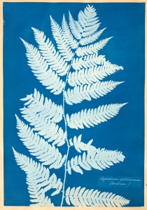
5. Anna Atkins. Aspidium goldianum.
from  Cyanotypes of British and Foreign Flowering Plants and Ferns, ca. 1850
Cyanotype
Wellesley College Art Museum.


This cyanotype, or blueprint, of a Goldie’s Fern shows another fascination of ferns: they appear to show a fractal self-similarity. The frond is made up of leaflets made up of smaller sub-leaflets, each having roughly the shape of the whole. Here there are only 3 levels of self-similarity, but there are ferns with 4 levels, that is, they have sub-subleaflets. This leads to the question whether these subdivisions might go on for ever, though not visible to the naked eye.

Is it this hint of the mise-en-abime which enchants us here? Are we nudging up against the sublime?

Ferns reproduce asexually. While spores are visible on the underside of leaves, there are no buds, flowers or seeds to remind one of sex or genitalia. I wonder if aside from the obvious beauty of their feathery symmetries, the absence of sexuality could have had something to do with Pteridomania or Fern-Fever, the Victorian craze for collecting ferns in the wild, and then using them in every sort of decorative art. This mania was in its peak from the 1830s-1890s.


6. Isabella Kirkland. Ascendant.  From the series, Taxa, 2006.
Inkjet print of oil paint and alkyd on canvas over panel.
48” x 36″

Sometimes floral desires inspire a different sort of search for knowledge. Rather than cutting things apart, Isabella Kirkland in her brilliant series of six paintings, Taxa, looks at how plants and their animal contemporaries are affected by humans, and how they are currently faring in the United States in terms of introduction, invasion, decline, and extinction. The product of huge amounts of ecological research, Kirkland’s superbly accurate works echo the technical mastery of Dutch 17th century botanical images. Her canvases are beautiful and overwhelming; each shows so many species that it is best to go to her website for the species key. Visitors are invited to view actual plant specimens depicted in these works at the Wellesley College Botanic Gardens

Ascendant, Kirkland says, “shows nonnative species that have been introduced in some part of the United States or its trust territories. They are all on the increase as they successfully out-compete native residents.“ If you enlarge this one and look at the expressions of gull, cat, or egret, there’s a subtle sly look of satisfied pride.


7. Isabella Kirkland. Back.   From the series, Taxa, 2006
Inkjet print of Oil paint and alkyd on canvas over panel
Dimensions: 48” x 36″

Kirkland says about this one, “The plants and animals in this picture have gone to the brink of extinction and been carefully husbanded back, or were presumed extinct and then re-found.” There are around 48 species in this one. Here on the faces of the genet, the owl, and the owlet, there seems to be a look of tentative surprised pleasure.


Flowers as the Work Table for the Imagination


8.  Bertha E. Jaques. Nasturtiums. 1937
Drypoint with hand coloring
Wellesley College Collection


Flowers take hold of our senses and our emotions; they make us fall in love with them; they impel us to scientific research at all levels from microscopic to environmental. But they also involve themselves with the intellect, in particular the imagination. Elaine Scarry, in the chapter “Imagining Flowers” from her marvelous Dreaming by the Book, claims that flowers are very easy for us to imagine with great vivacity. It is much more difficult, she says, for us to form a mental picture of a landscape, or a large animal, or the face of a close friend. She gives four reasons for the ease with which we can form mental pictures of flowers:

1) They are usually smaller than our heads (consider the nasturtiums here rather than the giant water-lilies above).
2) Their shape is related to the curve of our eyes and retinas.
3) Flowers have an “intense localization of color with a sudden dropping off at the edges.”
4) Their leaves are gauzy or translucent, their petals thin; gravity seems not to act on them very much.


But this is not all! Scarry goes on to make an astonishing argument: once we imagine blossoms, she says, we can use our mental image of their petals as the surface or work table on which we imagine other, more difficult things.


9. Dr. Robert John Thornton. The Night-Blowing Cereus.1800
From Temple of Flora
Wellesley College Library, Special Collections
Mezzotint, printed in color, with watercolor additions

A wonderfully murky scene: the church clock stands at two or three minutes past midnight; the flower has opened to its full radiance; the full moon is partly obscured, but its reflections gleam on the rippled water below.

On the print itself a small caption reads: “Flower by Reinagle. Moonlight by Pether.” In fact, Pether was a landscape painter who was so fond of nocturnal scenes that his nickname was “Moonlight Pether.” (A collection of his moonscapes can be found online, here.)

There are several varieties of night blooming cactus which go by the name Night Blooming Cereus; this one is Selenicereus grandiflorus, or Moon Cactus, which for some reason Thornton calls Night-Blowing. The flower blooms for a single night, then wilts grotesquely. Captivatingly fragrant, the open flower is huge, bigger than your face.

Why are we so amazed by size, so awed when our Turk’s cap lilies grow to be nine feet tall, or those water-lily pads in the botanical gardens are five feet across? Why do we take size so personally? Don’t we feel it in the gut?

Is it that we remain, in our minds, the measure of all things? Is it that ‘small’ is smaller than our palm, and ‘large’ is bigger than our heads, and ‘soft” is softer than our flesh?

In any case, a flower as large as the cereus has to be taken seriously. Even leaving aside its maddeningly attractive scent. You have to talk to it as an equal, never using the language we use with babies or small dogs.

I can’t resist bringing in to this discussion two of Dr. Thornton’s other illustrations from Temple of Flora.  They are not visible in the Davis Museum’s “Global Flora,” simply because the vast book is in a case under glass and we cannot turn the pages.

10.  Dr. Robert John Thornton. The Dragon Arum. From Temple of Flora, 1812
Beinecke Rare Book and Manuscript Library, Yale University

Thornton was a Public Lecturer on Medical Biology and he knew the darkness of flowers as well as the light: many of the plates in his Temple of Flora are as melancholy and brooding as the “Night-Blowing Cereus” and you wouldn’t want to venture into his dismal landscapes alone.

Occasionally he goes wild in his descriptions as well, as when he takes on the Arum Dracunculus or Dragon Arum:

“This extremely foetid poisonous plant will not admit of sober description; let us therefore personify it. SHE comes peeping from her purple crest with mischief fraught: from her green covert projects a horrid spear of darkest jet, which she brandishes aloft: issuing from her nostrils flies a noisome vapor infecting the ambient air: her hundred arms are interspersed with white, as in the garments of the inquisition; and on her swollen trunk are observed the speckles of a mighty dragon: her sex is strangely intermingled with the opposite! Confusion dire!––all framed for horror: or kind to warn the traveler that her fruits are poison-berries, grateful to the sight but fatal to the taste, such is the plan of PROVIDENCE and such HER wide resolves.”

This is one of the things I love about Thornton: how thoroughly he reminds us that the gaze with which we look at Nature is always refracted by the lens of Self. Plants do not grow out of context, even if we isolate them to look at them more coolly and scientifically. It is always a specific one of us, personal and peculiar, who acts as observer. Thornton, by his choice of the painters he commissions, and throughout his own descriptions, reminds us, in a way that the other artists and writers in this exhibition do not, that every observer has a psyche, and that the watcher is in constant feedback with the flower under observation.  The flower and the mood of the viewer affect each other unavoidably. While it is said that he places his flowers in their native contexts, it is sometimes the geography of the psyche that often interests him the most.

In contemporary botanical writing, I think Jamaica Kincaid’s Among Flowers: A Walk in the Himalaya most brilliantly brings out this interplay between the nature of the plant and the nature of the viewer.

11. Dr. Robert John Thornton. The American Cowslip. 1801.
From Temple of Flora.
Collection of the author.

Some flowers Thornton clearly loves: his view of the the American Cowslip or Shooting Star is mild and gracious. He calls it “a vegetable sky-rocket in different periods of explosion,” and “a number of light shuttlecocks, fluttering in the air” and notes Linnaeus called it Dodecatheon after the twelve Olympian Gods, on account of its singular beauty and the multiplicity of its flowers.

Each blossom here is at a different stage of development, from the immature bud through full flower to final seed pod. Against the glowering background the plant seems to radiate light as it demonstrates the cycle of life, decay, and rebirth from seed, echoing that luminous and mortal progression which resides in the inner consciousness of the gardener. I talk about this image more in my book Hinges: Meditations on the Portals of the Imagination.

What is it about Flowers, Anyway?

Although flowers are not geographically vast nor spatially infinite, aesthetically no matter how we try to capture them–in the end, what we come to see is that we can not understand the immensity of their beauty or the vastness of their effect on us. And in grasping that inability and the consequent awe it inspires in us, perhaps we are discovering not the feeling inspired by the hurricane or the rare and foreign waterfall, or the infinity of number, but one that we can put our face up against, that we can hold in our palms, the intimate sublime.


This review was first published on November 5, 2011 in The Arts Fuse


Filed Under: Galleries, Looking at Art Tagged With: Dr. Thornton, eroticism of gardens, poaching flowers, Temple of Flora

On Pete Baker and her Gardens

July 29, 2012 By Grace Dane Mazur

Pete Baker and her Gardens

(Memorial Service, Friends Meeting House, Westport Massachusetts. July 28, 2012)

Pete Baker.  Photo by Hope Millham

Many of you knew Pete when she made her first vegetable garden at 670 Drift Road. I didn’t know her then, but Geraldine says: the previous owner had graveled the space, so that Pete had to start by making her own dirt––She taught herself about composting, organic gardening, and then she did it… At 29 Drift Road, Pete’s gardening went into overdrive. It was all she wanted to do. She resented all other interruptions (winter, visitors) that kept her from it.

Pete’s Hands.   Photo by Hope Millham

I first met Pete in the early 1990s when she came over to the church we had recently moved into to see if she wanted the de-consecrated outhouse in our back yard. It was listing and dilapidated; of course she wanted it. Outbuildings of any kind, small and large, were an important part of her gardens. The fact that she wanted this, of course, made it seem suddenly desirable to me, and thus impossible to part with. So we kept the outhouse, and invited her to dinner.

When I told Pete I wanted to redesign the garden at the church, she took me in hand and taught me many things, among them the virtues of well-composted cow manure. (I was so impressed with her view of manure that I ordered a truckload of it to be delivered on my fiftieth birthday). While gardening, she taught me that nothing is fixed or frozen into place––every boulder, no matter how large, can be pried up with a long enough crow bar—and also every boundary can be transcended. When she saw the plans I had drawn up, she said, “Oh no! You have to leave enough of a grassy space in the middle for a couple to lie down and…couple!”

Pete was immensely generous with her time, and we went collecting in her sky blue truck to Sylvan’s and Haskell’s and Peckham’s and Avant Gardens. She taught by instruction, showing me how to free up potbound roots before planting, how deep to dig, when to give something a good whack––but she also taught by example: each of her gardens: from the small entrance terrace with the old bricks tracing the path around the circle of vinca with the pink rose; to the lacy mauve meadow rue along the walk by the house, to the grapes climbing up the arbor by the deck, or the crimson poppies in front of the greenhouse––each had a different mood, produced a different joy.

Outbuildings were part of the gardens, and so, too were stone walls. She cleared the stream and its stone channels so that the watercress would flourish. Further into the woods, she created the ponds, with their rushes and grasses and cardinal flowers. And deeper in the forest always she had woods-clearing and path-grooming projects. Sometimes Turk’s Cap lilies would appear where she had cleared the understorey. Again, boundaries didn’t stop her, and she was always game for a trespass into neighboring land. The whole territory was part of her canvas for bringing forth beauty.

A glorious example of Pete’s trespassing of boundaries, and also definitions was her award-winning exhibit at the New England Flower Show in 1992. It was, of course, A Cellar Hole. Her love of old buildings and history always led her to take pleasure in linking then and now. (She would often puzzle us by giving us directions to “Turn left at the old mill,” meaning “Turn left at the place where the mill once was, but now you see only undifferentiated forest.”)

She later described the effect of the Flower Show exhibit in her book, Collecting Houses:

 The ruins were too far gone to know what the farmhouse had looked like. All that remained was a section of chimney, the fireplace hearth, and a stone-lined foundation.

At first, she writes, she had been totally dismayed by the Boston Expo Center, with its cement floor, black cloth backdrop, fluorescent lights, and ceiling of corrugated metal. But then she and her colleagues put the stones in place, and “By the end of the day, the dark and light shapes of the stones had become linked together like an architectural amulet. Delighted, I poked tiny plants of violets and ferns in between the stones, then spread the artifacts in the cellar hole––pieces of blue and white earthenware, a ceramic jug, charred pieces of wood, broken bottles, a rusted axe, the sole of a shoe, animal bones, old quahog shells––things that defined a long-ago time.”

For Pete, such things were the core of narrative. She could construct any number of stories from them.

I went to that flower show and when I came to her startling construction, I didn’t think it was an exhibit. It felt as though it had been there forever, and the whole Boston Expo Center had grown up around it. It was a ruin, half covered with autumn leaves, bits of an old garden still persisting:vinca, laurel, and white lilac; columbine and wild geranium. It felt as though you weren’t supposed to be there––as though in order to have stumbled on this old cellar hole in the woods, you would have committed a trespass. And yet, it felt like the right thing to do. It was a necessary trespass.

Like every one of Pete’s gardens, it was a world, hidden and public and still strangely intimate. Deep and beautiful and full of the mysteries.

Pete climbing out of the barn.   Photo by Hope Millham


Filed Under: Life, Uncategorized Tagged With: Anne W. Baker, Cellar Holes, Gardens, Memorial, Pete Baker, Westport-MA

Emotion, Time, and Eros

June 5, 2012 By Grace Dane Mazur

Emotion, Time, and Eros in the Work of Damon Lehrer and Rick Berry.

Comparing Rick Berry’s energetic and sometimes frenzied canvasses with Damon Lehrer’s exquisitely rendered and contemplative work made me wonder about the expressionist style in general. By this I mean that artistic terrain where the passions, vehemence, or ferocity of the artist so colors the work as to form a powerful but distorting lens through which we see the work. The terrain where the figure seems built out of shards rather than strokes.

In this review of the exhibition “It Figures”  which showed at the William Scott Gallery,  in Boston MA in September, 2011, I look at a few of my favorite pieces and the questions that arise from them. (For the questions that the artists have for each other see Damon Lehrer’s interview of Rick Berry.)


Expressionism 

"No Metal Men" by Rick Berry
“No Metal Men” by Rick Berry

Rick Berry’s “No Metal Men” is violent, fierce with strokes of palette knife or finger or brush. One arm seems lopped off within the frame; the head, other arm, and legs are sliced by the edge of the picture. This is very much in keeping with the other works of Berry’s in the show: even when his style is calmer and more representational, he almost never gives us an intact face. Parts are missing, stripped, or smudged, as though the subject has been physically wounded or psychologically maimed. “No Metal Men” with its puzzling title and masterful hints of transparent glass or plastic, over wood, or is it bronze? with teal shadows, may indicate a statue or some non-terrestrial human figure. it is one of the strongest and most pleasing of his works here.

Of course all artists present their work through some lens or other, colored by their philosophy, their skill, their mood at the moment, and their intention–but in the classical tradition (perhaps because we have been so immersed in it) it seems as though we do not see the distortions, and can disregard those lenses. The painter paints; the viewer regards and thinks–seemingly free to go in any direction with those thoughts.

With expressionism, however, the artist so strongly imposes a view, that we are hemmed in and our thoughts and reactions are corralled along certain much narrower predetermined avenues, often along the lines of: the world is violent, cruel, rough, frightening, mutilating–albeit not without a certain spooky beauty.

This can work very well if the emotional energy of the artist strikes something within us. Then we go along happily caroming off the narrow walls of the expressionist intent, gathering more energy as we go. Swept thus, we forget to rebel against, or be offended by the closeness of the atmosphere, the breathlessness of the thought compartment where little is left for us to do. For the artist, with his shards and blades, has done a lot of the imaginative response work for us. At times, of course, this is not by choice. This is simply the way this particular piece has to be. Art arises from the passions, as well as from the intellect, and is by nature informed and colored by its genesis.

When it doesn’t work, though, when the energy and vehemence just seems like so much hacking and flailing, then it can leave us flat or even annoyed. We wonder why the artist doesn’t trust us to invent our own responses, and feels that all the emotion must be spelled out by the surface execution of the work.

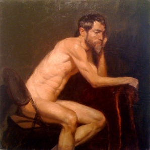
"Max" by Damon Lehrer
“Max” by Damon Lehrer

For a wonderful contrast, we can turn to the quiet seated nude, “Max,” by Damon Lehrer, which draws us in with its stillness. We might completely overlook this one on our first tour of the gallery; it is a small painting, in quiet warm tones, vulnerable and strong, and it doesn’t boss us or hector us. Although he sits on a chair in what looks like a studio, leaning on a high reddish stool, the man has the feeling of a hermit in a cavern. He is contemplating or meditating. We are being given permission to watch him, if we are smart enough to stay our gaze.


Time and the Figure 

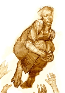
"Jump" by Rick Berry
“Jump” by Rick Berry

Many of Rick Berry’s works in this exhibit seem to show a timeless portrait, or else the aftermath of some brutal strain or mutilation. Looking at the aftermath paintings, we hope that whatever it was wasn’t too painful, and that the protagonist, and perhaps even the antagonist, have achieved some sort of rest. Though we doubt it.

Here, however, in the sepia monotone of “Jump!” there is no brutality. We are placed in time, in the middle of an action: A boy, or young man, grasps his knees as he jumps or is thrown above a quartet of hands. Trying to make sense of his partly smudged face, it takes us a moment before we notice that he has grotesque paws instead of feet. He is neither all there nor all human. We may be in the middle of things, temporally, but we know there are only a few outcomes: being inhuman, he will fly away; he will fall to ground and escape; he will fall to ground and be caught.

"The Grownups" by Damon Lehrer
“The Grownups” by Damon Lehrer

It is the temporal aspect of Damon Lehrer’s “The Grownups” that lured me into this exhibit. We rarely see, I think, such an odd and present moment in the world of art.

We are here, now, rooted to the present. Two children–a toddler and his slightly older sister–are adrift on a raft heading out to the horizon of a warm coral sea. Their only provisions are a box, a pillow, a jug of flowers and a teapot. They seem to be under-prepared for their journey, except for the severe intelligence of the girl, and the trepidation and obedience (don’t move! she must have told him.) of the boy.

What makes this moment spectacular is that the subsequent adventures, which we can only imagine, are equally important, if unknown. We can and must imagine them. On seeing this canvas we must write a novel about what will happen. Not of what led up to this odd situation–many paintings are aftermath paintings–or not only of what preceded, but of what will happen.

I wouldn’t call this work perverted, or even “perverted baroque,” as the press release terms Damon Lehrer’s work, but I do think it is marvelously perverse. Partly because of the palette, which reminds one of the gentlest pictures of and for children. And partly because of all the ambiguities, including that of the leaping fish: is he after the spray of blossoms? Is he coming for the children? Or is he offering himself as food for when they get to their desert island? (She will be Crusoe, her brother Friday…) Or does our fish leap simply from some sort of cosmic joy? This picture doesn’t tell us how or what to think or respond. It simply insists that we must.


Eros and the Figure – The Dance 

"My Parents before I Knew Them" by Rick Berry
“My Parents before I Knew Them” by Rick Berry

We cannot see the faces of either of these dancers, in Rick Berry’s “My Parents Before I Knew Them” and their heads are dark shadows in a blackish mauve mist. But our parents before we were born are always mysterious figures. Perhaps these two have lost their heads to love. Then, too, the darkness that enshrouds this couple could be there to remind us of the impossibility of imagining the erotic life of our own parents. But there is also a sense of menace here. There is something about the way those globe lights don’t illuminate the mist–combined with the strong and awkward grip of the man’s hand, and the unwilling body language of the woman–that makes this seem less like a sexy tango, more like a dance of death.


Eros and the Figure – The Orgiastic Picnic 

"Lethargic Picnic" by Damon Lehrer
“Lethargic Picnic” by Damon Lehrer

I think it may be rare that in classical erotic scenes of humans and animals everyone is having a good time. As far as I can recall, the animals, gods in disguise, are content, while the ravished ladies are appalled or worse.

But here, in Damon Lehrer’s “Lethargic Picnic”–in a composition echoing Gericault’s “Raft of the Medusa”¬–what a marvelous tangle of delighted bodies! Exhausted from sex, the young man dozes, while the leopard drapes himself across his body, between the two young women whose arms are linked. Everyone is entwined with everyone. Their ecstasies had not been quiet, however, and now a tiger approaches from the forest hoping to participate, while a crow and a squirrel by the young man’s head are wondering if they, too, can join in.

Oh, this is splendidly erotic, and of course perverse, the scene itself, but also the execution: the masterful rendering of the large cats, particularly the tiger, combined with the exquisite modeling of the delicate skin tones of the human forms obscures for a moment the fact that each figure is in a posture which seems at first classical and then twisted and off-kilter. For something has alarmed the women: one points, the other raises her red shirt like a flag, semaphoring out to sea. Even the young man’s foot is pointing into the air. Is there is a hint of his foot being cloven? Or is it just the space between his toes?

The women have just noticed something pinkish in the water, beneath the slanting rust-colored tree. It’s hard to see from here, but it might just be those children, on their raft, floating out to sea.


Figurative Art 

I wonder to what extent it is true that figurative art is more likely to move us than pure abstraction. When swathes of color and line fascinate, is it like the illumination of looking into a good tool box—where we see the elements and instruments, and thus the possibilities of art? When raw color astonishes the retina, does it also fully engage the mind? Or do we crave something more, such as the figure, with its intimations of the human condition, to make us weep or wonder?

This review was published on September 24, 2011 in The Arts Fuse

Filed Under: Galleries, Looking at Art Tagged With: Damon Lehrer, Eros and the Figure, Expressionism, Figure and Time, Orgiastic Picnic, Rick Berry, William Scott Gallery

The Strange Beauty of Prints and the Pursuit of Knowledge

June 4, 2012 By Grace Dane Mazur


The Strange Beauty of Prints and the Pursuit of Knowledge.

On exhibition at the Arthur M. Sackler Museum of the Harvard Art Museums
Fall, 2011.     

Prints and the Pursuit of Knowledge in Early Modern Europe examines how celebrated Northern Renaissance artists contributed to the scientific investigations of the 16th century. The exhibition and its accompanying catalogue challenge the perception of artists as illustrators in the service of scientists. Artists’ printed images served as both instruments for research and agents in the dissemination of knowledge.
(Curatorial Description from the Museum website)

The time period covered in this exhibit represents a shift towards direct experimentation and observation of the natural world, away from relying on ancient classical texts for scientific information. While the show is largely prints and books, there are also instruments—sundials, globes, astrolabes and armillary spheres–made from printed paper. There are even flap books showing different layers of internal organs of males and females, early precursors to children’s pop-up books. Some of these has have been assembled from printed reproductions and we are invited to handle them.

This exhibit is so beautifully curated, by Susan Dackerman, the Carl A. Weyerhaeuser Curator of Prints, that I take it as a given when she says: “…we really wanted to explore the important role artists played in scientific inquiry of the 16th century. One of the things artists did at that time was help theorists visualize kinds of knowledge, and by helping them visualize it, they actually helped them in many cases conceptualize it as well.”

Accepting the premise of the show catapults me into other questions and fascinations that come from gazing at some of the individual works. I will just touch on a few of my own favorites, here, for the show is vast. The section headings are my own, just to help us all navigate through this review.

Man and Geometry 

Portrait of van Deventer by Goltzius
Hendrick Goltzius, Portrait of Nicolaus Petri van Deventer, 1595. Engraving.

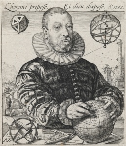
Holding the world in his hands, surrounded by the tools of his trade, the mathematician and astronomer Nikolaus Petri van Deventer looks off into the distance over our right shoulder as he makes his calculations. Behind him in the distance, a man with a sextant measures the height of the one remaining column of a ruined temple. Although the French at the top of the picture proclaims “Man proposes, And god disposes,” it might be more fitting if it said, “Man is the Measure of All Things.”  Petri is shown in the middle of four perfectly formed geometric objects: a polyhedron (probably an icosahedron) on the upper left, an armillary sphere  upper right, an astronomical sphere and the globe, on his table. No matter how perfectly curled the segments of his ruff, how perfectly round the nubbins of his buttons, his face and hands are rather lumpishly human…and yet it is we humans who invent, or discover, the perfections of the geometric forms.

The Truth of the Fine Black Line

Pilot Whale
Unknown artist, after Hendrick Goltzius, Pilot Whale Beached at Zandvoort, 1594. Etching and engraving.

What would we do if we came across a dead whale on the beach, and we had never seen one before? I would stand there for a bit, muttering, What is it? Do fish get that large? That is one huge fish. Then I would pace it off, or if I was feeling more scientific, measure it, as these two men are doing, with a rope of some sort. The artist here is allowing us to measure it, too, by putting the arm of the man on the right more or less in the plane of the whale, and if a man’s arm is about a yard, and so this animal seems at least 21 feet long…

I was a research scientist for a couple of decades, before turning to the other truth of Fiction writing. When I think of Science, even now, it is associated with the fine black line. For me, the fine black line is the visual counterpart of the Greek or Latin neologisms that flavor so much of medicine and science; it is a sign that the scientific mode of thinking may be involved here.

Dürer and some of his colleagues were able to get wonderful detailed lines in their woodcuts, but the copperplate engraving allows another order of magnitude of precision. With the wood block one always has the problem of working with or across the grain while carving, and limits to the amount of pressure and number of impressions one can make before the block itself breaks.

Anyway, with the print–either by woodblock or the technological innovations of copperplate–comes the possibility of sudden widespread broadcasting of the new empirical and observational scientific findings. Thus it could be that these 16th Century artist-scientists are in fact responsible for our association of fine black lines with science.

I wonder if our notion of sharp ideas or incisive thinking is linked to the sharpness of the engraving tool– the burin–and the way it cuts so finely into woodblock or copperplate.  Conversely, fuzzy ideas, or “painting things with a broad brush,” we associate with imprecisions and omissions.

This leads me to wonder, What if the technological innovations in art in the 16th century had been not connected with fine woodblock cutting or copperplate engraving, but rather with lithography or some other broad brush process? Would our whole notion of scientific thought and illustration be hugely different? I am reminded of Junichiro Tanizaki’s odd little masterpiece, In Praise of Shadows, where he conjectures what would have happened if the modern hospital had been invented in Japan, with its shadowy interiors, sliding paper panels, and floors made of woven grass.

Back to the matter at hand. I mentioned that for me the fine line is the visual counterpart of the Greco-Latin language of science; that language both clarifies, to those who know, and obscures, to those outside the field. Polymyalgia they say, instead of many muscles hurting. But the fine line of the print is meant only to convey and to clarify. Its own precision carries with it the implication of accuracy and truth. We have to believe it. This can lead to interesting problems, as we’ll see below.

Durer Rhinoceros
Albrecht Dürer, Rhinoceros, 1515. Woodcut and letterpress.

For ages, this image has been the iconic rhinoceros for me. Even though I have seen such beasts in the zoo, it is this picture that I believe. I know that they are not as reptilian or scaly, in real life. I know that they don’t have plates like an armadillo. But still, this is the picture I would grab, needing one of a rhino. Even though this is a woodcut (with letterpress at the top for the writing), the black lines are so fine that if you zoom in, or blow it up, you’ll see every hair lining the ears, every bristle on the muzzle. For years and years I had a print of this hanging in my house. I never noticed that inaccuracy, that piece of un-truth: that second horn, the spiral one projecting from between the beast’s shoulders, pointing toward the “R” of Rhinoceros. Discussing this horn, the catalogue mentions that Durer never saw the animal himself, and worked from notes and sketches of someone who had seen it in Portugal, the first Rhino to come to Europe since the 3rd Century. I know that dorsal horn is “wrong.”  But with all those fine black lines, all Dürer’s genius and virtuosity, it is hard to disbelieve.

Durer's Melencolia
Albrecht Dürer, Melencolia I, 1514. Engraving.

Another well-known Dürer print brings up a new set of questions. This image occurs in the part of the exhibition devoted to “Allegory,” in which humans or gods represent attributes or senses. Books and books have been written on this astonishing picture, so I will just mention what happens when I look at it for a while. The more you magnify the picture, the lighter it becomes, and as the winged female figure comes out of the shadows, it becomes impossible to see her as melancholic. She does not have “black bile” the original meaning of melancholia. She is not grieving or sad or depressed. If she is focusing on some cosmic judgment, it is alloyed with cosmic humor. She, and the cherubic figure beside her are in the throes of work. She holds dividers, which, as the catalogue notes, are the tools of divine or human creators. Her work-space is a mess, but her mind-space, which I think is represented by the things which hang on the wall above her—balance, hour glass, bell, and magic square––is full of order. The wikipedia entry on this print suggests that the “1” in the title “ refers to the first of the three types of melancholia defined by the German humanist writer Cornelius Agrippa. In this type, Melencholia Imaginativa, which he held artists to be subject to, ‘imagination’ predominates over ‘mind’ or ‘reason’.”

What a relief!  She is not full of black bile! She is deep in the work of the imagination.

Durer's Magic Square
Detail of Melencolia 1. The Magic Square

The curatorial wall notes for Melencolia 1 point out that the magic square on the wall above the wing of the female figure is in itself rather amazing:

Each side and each diagonal add up to 34.

So do the four inside numbers.

So do the four corners.

So do the facing inner pairs of numbers on opposite sides.

The date of the print, 1514,  is centered in the bottom row.

Mathematicians call this the  “Dürer  4×4  Magic Square.”

The catalogue of this exhibition tells us that Dürer was the first one to make prints of celestial charts of constellations and planets. Soon after that artists began to adapt such charts to long oval gores as in the 3 sheets below by Saenredam. (There had been a 4th sheet, but is is missing.) These gores were meant to be cut out and then bent and glued onoto a wooden sphere, which they would cover except for caps at either pole. There are some examples of such celestial globes in the exhibition that can be handled.

Celestial globe gores left

Celestial globe gore right
Jan Saenredam, from Celestial Globe Gores for Willem Jansz. Blaeu’s Sphaera stellifera. Before 1600.

I’ve always found terrestrial globes exciting, but these celestial ones are of a different order of marvelous. And they are wonderfully puzzling in a show devoted to science.
Here’s what fascinates me: Terrestrial globes are spherical, and we handle them and look at them from the outside. They are a model of the round earth on which we stand.
But standing on the earth, we are inside the heavens. A proper model of the constellations and planets would be a sphere surrounding us. But if the printed gores were glued to a hollow sphere, face down, that is, facing something inside, we couldn’t see inside, or if we could, through peepholes, say, it would be extremely awkward. So the artists and scientists who made these celestial globes made them analogous to the usual terrestrial globes, facing outward, but with constellations instead of land and sea.
But who could view our constellations and planets from above? Who looks down on the Milky Way? Not our sub-lunar selves. Holding these star spheres in our hands, as this exhibition invites us to, we become gods.

Arithmetic
Cornelis Drebbel after Hendrick Golzius. Arithmetic, from the series The Seven Liberal Arts. After 1587. Engraving.

Here, Arithmetic, personified as a hefty blond goddess, is teaching the numbers to her young male companion. Something odd has happened to her filmy bodice and one of her breasts exposed. Then, as now, the naked bosom captures our attention, and many of the allegorical figures in this exhibition are women in extreme conditions of undress. The fine black lines here, along with the geometric forms taken by the books on her shelf, and the rondels of glass in the window make us believe in the truth of the lesson. But something odd is going on here as well, for she has left out the number 9. (Zoom in if you need to, its absence is very clear.) Neither the catalogue nor the wall notes mention this, so it is ours to question!

Is this a form of copyright protection, to insert a known “wrong,” and see if it gets promulgated? Did the student not pay the full price for his lesson? Does the word for 9 in Dutch have an obscene ring to it, the way it did for Isak Dinesen’s Swedish teacher of Swahili? Or is the number 9 occult or mathematically esoteric, that the student may not learn it yet? Can you “cast out nines” before you even learn of their existence?

In any case, for me this was another case of the fine black line giving the illusion of accuracy, leading me into the belief that I was seeing the full array of numbers on her tablet, until I finally saw the puzzling omission.

Note that I’m not saying that the fine black line is there to trick us. Not at all. For years I was a microscopist and I still love the finest lines, the highest resolution. But those fine lines have to deserve our belief in their veracity.

Making Tools Visible 

Invention of Copperplate Engraving
Unknown engraver, after Stradanus. Invention of Copperplate Engraving from Nova Reperta (New inventions and discoveries of modern times) c. 1599-1603

Here we see not the process of inventing, but what happens during that process, which had been recently invented. In the lower left a boy on a bench copies a drawing, engraving it onto a copper plate. In the middle, the first figure heats the plate, while the one behind is either rubbing ink onto the warm plate, or rubbing the excess ink off. Behind them, to the left, a plate hidden by the paper lying on top of it, is rolled through the press, which so heavy that the man in the far left must put his foot and body weight to push on the lower spoke as he pulls the upper one toward him. In the back of the room the prints are being hung on racks so the ink will dry.

I kept expecting that the plates they were working on would show the very scene we are looking at, in the manner of Escher–a mise en abime, also known as ‘the Droste effect.” But though they are hard to see, the one on the left looks like architectural drawings, the middle one a crucifix, and the one on the right a man leaning on a stick. But Stradanus and his engraver were not playing this game.

In any case, this image of the printing process made me wonder about making visible the tools and elements of art. The tools for scientific observation and measurement–telescopes and compasses and dividers and rulers and gnomons and sextants occur throughout the prints having to do with mathematics or astronomy or navigation; we see a (flawed set) of numbers in the allegory Arithmetic, and in the magic square of Melencolia 1 we see some elements of Number Theory.

In poetry it is easy to show the elements, as individual words or sounds can be so loaded, electric, fundamental, that the whole work can hover and hinge there. In fiction it is harder–to make the tools visible in a way that is deep and interesting. James Joyce reminds us, at the beginning of A Portrait of the Artist as a Young Man, that we all start with baby talk:

Once upon a time and a very good time it was there was a moocow coming down along the road and this moocow that was coming down along the road met a nicens little boy name baby tuckoo….

And Julio Cortazar, at the beginning of his story “Blow Up,” shows that psychic trauma can destroy the syntactic tools that, as adult speakers of the language, we take for granted:

It’ll never be known how this has to be told, in the first person or in the second, using the third person plural or continually inventing modes that will serve for nothing. If one might say: I will see the moon rose, or: we hurt me at the back of my eyes, and especially: you the blond woman was the clouds that race before my your his our yours their faces. What the hell.

It could be that in fiction our tools become most visible when they are broken or out of order. We notice syntax when it has devolved into nonsense as it has in the passage above. Happily neither Portrait nor “Blow Up” stay in that babyish or broken mode for long. But those modes shake us up and allow us to see the building blocks.

For the best visualization of the tools of art, I think we have to turn to a painting by John Singer Sargent. It is not in this show, it’s in the Brooklyn Museum, but an exhibition as deep as Prints and the Pursuit of Knowledge can lead us anywhere.

Sargent's An Out-of-Doors Study
John Singer Sargent An Out-of-Doors Study c. 1889. Oil on canvas.

In this painting of the artist Paul César Heleu and his wife Alice, Sargent paints the canoe, paddles, canvas, palette, brushes, as well as the clothing, hats, and skin of his two friends in a smooth, flowing, classical manner. But when he comes to the grasses, everything turns all spiky. Well, grasses are spiky, so at first we’re not surprised.

Detail of Sargent's Study
Detail of Sargent

But then we look at Heleu’s fist-full of brushes, and the care with which he uses one of them, and we see the grasses in green, white, and rust encroaching on the canvas, and we realize that Sargent has built the grasses out of single brush strokes, which of course is how he has had to build everything. He has put into Heleu’s hands the artist’s material elements: canvas, pigment, brushes. But the working tool, the brush strokes, are his own, and he shows us how they turn into grasses before our eyes. His brush strokes are the poet’s words, the number theorist’s numbers.

The Difference between Art and Science 

Title Page from Vesalius
Andreas Vesalius, and unknown woodcutter.
Title page from Vesalius De humani corporis fabrica libri septem (Seven books on the fabric of the human body). 1543. Woodcut and letterpress.

This is the title page from an anatomy book by the scientist and artist, Vesalius, showing an anatomy lesson where he is performing a dissection. Taking place in an amphitheater, it’s sort of a circus: a monkey is at the left hand margin; a dog in the lower right corner; a skeleton hangs above the cadaver; a naked man leans from an alcove, as though we were a statue come to life.

What is art, what is science? I used to be a scientist. Now I am a writer. This is an exhibition about the world of science, and the way that 16th century artists influenced that world. You would think that I would be able to think about this sanely, if not answer it. Perhaps we can reduce the question to something more manageable: if we look at any one of these prints, and read the wall notes, can we tell if it is art or science?

If we are among those who hold that there are some wonderfully simple rules for art—rules like harmony, balance, proportion, symmetry, movement—then we would call most of the pieces in this exhibit ‘art.’

If, like Edmund Burke, we feel that beauty depends on some specific physiological response (e.g., its pleasure depends upon something like a relaxing effect on the fibers of the body) we might call a smaller number of them beautiful.

But, if–as in Kant’s Critique of Judgment–we insist that the purely aesthetic response to an object of art is essentially without rules, and is focused on those aspects of the work that were conceived with no purpose, although deeply purposive, then our view of whether Science or Art is the primary terrain of these prints–star charts and beached whales, anatomy lessons and allegories–would lean further toward Science than toward Art.

Perhaps another way of looking at this would be to ask about the intention of the printmaker: Is the intention to inform and educate crowding out the intention to evoke emotions or aesthetic senses? Or does it go the other way?

Does any work showing a nude become a work of science if the musculature is shown with stunning accuracy?

Could one say that Art leaves out everything it can, while Science puts in everything it must? Not because it can all be parsed at once, but so it will be there when you need it; it is valuable to have as much information as possible in one place. Scientific prints can be amazingly dense and many of the ones in this show are mind-boggling.

Rembrandt's Anatomy Lesson of Dr. Tulp
Rembrandt . The Anatomy Lesson of Dr. Nicolaes Tulp. 1632. Oil on Canvas. Mauritshuis, The Hague. Photo: Wikimedia Commons.

Darting away from the Harvard Art Museums again for a moment, here is how Rembrandt looks at the anatomy lesson. He has left everything out except for the corpse, the doctor, and seven onlookers, one of whom seems to be gazing at us rather than the lesson. The effect is immense and immediate. Life, death, and learning. Is it the clearing away of excess information that intensifies our emotional and aesthetic response?

The...Lesson in the Country by Herman Braun-Vega
Herman Braun-Vega. The…Lesson in the Country. 1984. Acrylic on canvas.

In this homage to Rembrandt, the Peruvian painter Herman Braun-Vega keeps five of Rembrandt’s onlookers. He has replaced Dr. Tulp with an officer of an undefined Latin American country. Three local people pay no attention to what is going on with the army officer and the cadaver; a woman a few feet away acts as witness, but does not stop plucking her chicken. The picture is influenced by photographs that were taken of Che Guevara right after he was killed, though the corpse itself is taken from Rembrandt. There are only two more figures in Braun-Vega’s version, ten in all, but because of the social and political intentions of the artist, our response is no longer the breathtaking and sudden consciousness of mortality that we get from the Rembrandt painting, but flies out in many directions and contains strands of guilts and puzzlement as well as reactions to the vibrant palette. By adding the intentionality of sociopolitical consciousness, has the artist diluted our aesthetic response?

I see that my question has turned into: where does our intellectual response leave off and our aesthetic reaction begin? Or vice versa. It could be a case of “the farther off from England the nearer is to France,” and all these prints are inviting us to a Mock Turtle’s Quadrille of Art and Science.

Perhaps we could say that a great work of art interrogates us. The Title Page of Vesalius does not do this (for me), but Rembrandt’s Anatomy Lesson does. We might not have to change our life after seeing Dürer’s star charts, but we might after studying his Melencolia-1. When he is a scientist he informs us; when he is a psychologist he moves us; when he is a theologian–for I do think Renaissance artists often act as silent and vehement theologians–he can terrify us (*). And when he is an artist he asks us to explain who we are.

Prints and the Pursuit of Knowledge has the strange beauty and density of a scientific diagram or star chart. You can’t examine it deeply all at once. It is best to take a certain reading, see what questions arise, and then go off alone to your lair to think.

(*) For examples of this, see my book Hinges: Meditations on the Portals of the Imagination.

A slightly different version of this essay appeared on The Arts Fuse on September 18, 2011  

Filed Under: Looking at Art Tagged With: Celestial Globes, Difference between Art and Science, Early Modern Europe, Harvard Art Museums, Herman Braun-Vega, John Singer Sargent, Man and Geometry, Melencolia, Rembrandt, Tools of Art

Hinging between Worlds

April 3, 2012 By Grace Dane Mazur

Hinging between Worlds: The Cenote Series:
Paintings by Anne Leone at the Dedee Shattuck Gallery.

This gallery opened in 2011 in Westport, Massachusetts. It is a transcendent space with stunning exhibitions.

From the outside, it looks like a cross between a Quaker meeting house and a lookout tower–a lighthouse, perhaps, or the house of a local sea captain. Once inside, you get that vast Quaker light. A central staircase leads to the turreted loft above, forming unexpected angles and crannies. No matter where you stand, the staircase blocks some of the exhibition wall, and you must walk around or under it to discover what was blocked from view. The corners, though, are the most astonishing. Corners generally trap your gaze a bit, making you trace the angles of the shadowy seams–but here each corner is a tall window bringing in the lambent sea-light and the Westport countryside.

Along with art exhibits from now until December, Dedee Shattuck has scheduled readings, lectures, and concerts. (See the website and also the end of this review for more precise information.) This is a transcendent space, one that invites all kinds of contemplation and celebration, mystery and delight.

Like the gallery that houses them, the paintings of the Cenote Series by Anne Leone, on exhibit until September 25, 2011, are thought-provoking and full of wonderful reversals.

Anne Leone: Cenote Series: Six Swimmers #6
Acrylic on Linen – 50” x 128”

Entrance

Entering the exhibition, surrounded by large canvasses of swimmers seen from underwater, my first reaction is, Help, I need the surface! I won’t be able to breathe. Get me out of here! Let me at least look away.

Anne Leone: Cenote Series: Ten Swimmers   Acrylic/Linen – 50” x 128”

But these views are too fascinating to look away for long. There is a certain silence here, reflected by the muted palette with its gem-like hues, emerald and sapphire along with opals of the darker sort, the turquoise Colorado opal, the black opal. The only yellows here are ochres, the reds have mostly been filtered by the cool watery light to copper or wine. These paintings are all acrylic on canvas, with what appear to be multiple layers of clear glaze. This technique leaves the surface of the painting glowing and almost reflective, as though echoing that other surface, the membrane between air and water, that is one of the major subjects of each of the canvasses.

This is a show that provokes thoughts and questions, many of the canvasses acting as springboards into other realms of thought. Of course, as with any deep art, no matter how much I try to give you a sense of how I read the paintings, what will come out is how they read me.

 Reversals

In each of these works, as in the corner structures of the Dedee Shattuck Gallery, there are astonishing reversals: what we usually see–things in the world of air above–is suddenly hidden. What is usually kept from us by the surface reflections, or by murky obscurity, is here revealed.

Anne Leone: Cenote Series: Two Swimmers  #1        Acrylic/Linen – 50” x 40”

About the Artist

From the gallery website:

Anne Leone’s paintings have been featured in many exhibitions in the U.S. and abroad. An art professor at UMass Dartmouth for 20 years, she now devotes her time to her own work and lives with her husband, Daniel Ludwig, in both Southeastern Massachusetts and Brooklyn, N.Y.

Cenotes

The title of this group of paintings by Anne Leone is “Cenote Series.” A cenote is a natural limestone pool often with a fairly small surface opening that can be a portal to an immense aquatic cave system. Cenotes tend to be unusually clear, as the rainwater that fills them has been filtered through the bedrock. Most often found in Central America and Mexico, the cenotes in these paintings are in Quintana Roo, Mexico. Anne Leone has been studying these cenotes since 1993. The exceptional clarity of the water shows in these paintings in the crystalline quality of the light, sometimes pierced by shafts of sun, or perhaps by falling water.


Anne Leone: Cenote Series: Swimmers and Rope                  Acrylic/Linen – 50” x 70”


Each of the paintings shows the water’s surface, always from below. The world of air is invisible to us, off limits, mysterious. This membrane between worlds appears closed, but is easily pierced by the swimmers, resealing itself each time they rise and plunge. The ripples and reflections that usually obscure our view from above, are now doing the same to us below.

 Anne Leone: Cenote Series: Four Swimmers           Acrylic/Linen – 46” x 70”

Except for one or two, most of these swimmers look adolescent to me, and I read these paintings as echoing the strange oscillations of the adolescent between the world of the child and the world of the adult. Their heads are most often in a different space from their bodies.

 Torso

 Anne Leone: Cenote Series: Torso     Acrylic/Linen – 28” x 20”


The most striking and thought-provoking painting of this collection is called “Torso.” The red haired girl who appears in many of the other paintings floats in the clear green water of the cenote with her back toward the viewer. Above delicately shaded hips and waist her scapulae, shoulder blades, and ribs, suggest the structure of wings.   This figure is ghostly as well as beautiful, for her head and arms are above the water’s surface, thus invisible to us, and she appears as a torso.

She brings to mind all those classical statues that are now only torsos. Where is the head of the Archaic Torso of Apollo? Where are all the missing heads, all those arms? Marble lasts forever; it doesn’t just disappear. Did the farmers whose plows knocked against those heroic statues keep an unearthed part or two? Would we find a marble head if we searched enough barns or outbuildings in rural areas of Greece or Sicily or Turkey? Of course, the pieces of statues may simply get separated in the heat of archeology, so that they now find themselves in distant museums. Perhaps most of them are known and catalogued, but the curators are unwilling to give up any single part to make a foreign statue more complete.

Or do broken limbs of ancient statues congregate in hidden passageways of Pinakothek or Louvre just as every house has a secret room in the attic where all the screwdrivers and scissors end up.

Perhaps, as in “Torso” by Anne Leone, all the missing parts are simply in a different medium, a different phase, into which we cannot see.

Anne Leone: Cenote Series: Single Swimmer #2        Acrylic/Linen – 26” x 14”


Eroticism

Looking at these paintings I kept wondering, why are they not more erotic? For even though we gaze at all these bodies, nude except for bathing suits and bikinis, eros is largely missing. It’s true that often there is a cool tinge to the skin tones, due to the aquatic light of the cenotes. But that’s not all. Perhaps you need gravity. That is, perhaps the body has to be encountering or denying gravity. Could spacemen floating free of earth’s pull ever be sexy–even if they weren’t wearing those absurd costumes? Are angels erotic? The only erotic angels I can think of are those who have been grounded: “How art thou fallen from heaven, O Lucifer, son of the morning.” Lucifer is always erotic, but he has plummeted. So, too, the angel. on the cover of Stephen Mitchell’s translation of Rilke’s Selected Poems—if it is an angel. It may just be grounded wings mysterious and interacting with a human form. Or the angel Daniel who comes to earth in the movie Wings of Desire—he has to lose his angelic qualities in order to experience eros. He thump-crashes onto the ground, as gravity takes hold of him.

Dance is so often erotic, especially when it seems to defy gravity. But that seeming is important to us; we know it is only appearance, and I think we are constantly and perhaps unconsciously measuring the dancer’s art against our own groundedness. Once someone really defies gravity, we lose interest.

Or is it due to the missing gaze? We see almost none of the faces of our swimmers here, and when we do see them, they are ignoring us. Nor do they seem to be looking at each other. There is a lack of encounter. They may be conversing with each other above the surface, but we are not privy to that, and even their bodies, suspended in the silence of the water, do not seem conscious of each other. Perhaps because they are not posed, there is a randomness to their arrangement, and sometimes the slightly gawky limbs remind us of a bug or insect, not completely at home in the aquatic environment.

Anne Leone: Cenote Series: Three Swimmers #6                   Acrylic/Linen – 46” x 36”

I think interaction, or possibility of interaction, with us, or others, or earth’s own electro-magnetic force, just might be necessary.

In any case, if there is an interaction here it is between the bodies of the young swimmers and the medium in which they are suspended. We can only look on as they explore the humor of buoyancy and the marvel of hinging between worlds.

***

Information

DEDEE SHATTUCK GALLERY, 1 Partners Lane, Westport, Massachusetts.The exhibit of Paintings by Anne Leone ran from August 12 to September 25, 2011.

The gallery is located behind Partners Store   (off 865 Main Road)  Westport, MA

OPEN – APRIL through DECEMBER

DAYS & HOURS – Tuesday through Saturday 10am to 6 pm  Sunday – noon to 6pm

Website – http://www.dedeeshattuckgallery.com

Mailing address –   1 Partners Lane, Westport, MA 02790

Phone – 508-636-4177

E-mail – [email protected]

Filed Under: Galleries, Looking at Art Tagged With: Anne Leone, Cenotes, Dedee Shattuck Gallery, Membranes between Worlds, Underwater, Westport-MA

Copyright © 2025 Grace Dane Mazur · Site Design: Ilsa Brink